5. Descriptive data analysis#
What do we use Python for?#
In ‘DaLi topic 1: Basics of data evaluation’, the most important forms of visualisation and key figures required for data evaluation were presented.
As soon as we are dealing with the processing of real data sets (usually very extensive), software can help us to create certain key figures and forms of visualisation. This DaLi topic is therefore about analysing and visualising these data sets using software (Python or R).
To get a first impression of how we can use Python in this context, we use the ‘Tips’ dataset from ‘DaLi Topic 1: Fundamentals of data analysis’ that we are already familiar with.
Brief description of the data set Tips#
A waiter recorded information on every tip he received in a restaurant over a period of several months. Several variables were recorded:
Bill amount in dollars (
total_bill)Tip in dollars (
tip)Gender of the bill payer (
sex)Smokers among the guests (
smoker)Day of the week (
day)Time of day (
time)Size of the group (
size)
In the following, we will first briefly explain what the following code does and then you will find the code and the corresponding output.
Get initial information about a data set#
The following two functions are built into Python via the pandas library. They are useful for gaining an initial overview of a dataset and the characteristics of its features.
info()provides details about the data structure, such as column names, data types, and the number of non-missing values.describe(include='all')returns summary statistics for each column — including minimum, maximum, mean, quartiles, and more. It also includes categorical variables ifinclude='all'is specified.
These functions are ideal for quickly identifying potential issues (e.g. missing values or incorrect data types) and getting a basic sense of the data distribution.
import pandas as pd
tips = pd.read_csv("tips.csv")

tips.info()
tips.describe(include='all')
<class 'pandas.core.frame.DataFrame'>
RangeIndex: 244 entries, 0 to 243
Data columns (total 7 columns):
 #   Column      Non-Null Count  Dtype
---  ------      --------------  -----
 0   total_bill  244 non-null    float64
 1   tip         244 non-null    float64
 2   sex         244 non-null    object
 3   smoker      244 non-null    object
 4   day         244 non-null    object
 5   time        244 non-null    object
 6   size        244 non-null    int64
dtypes: float64(2), int64(1), object(4)
memory usage: 13.5+ KB
| total_bill | tip | sex | smoker | day | time | size | |
|---|---|---|---|---|---|---|---|
| count | 244.000000 | 244.000000 | 244 | 244 | 244 | 244 | 244.000000 |
| unique | NaN | NaN | 2 | 2 | 4 | 2 | NaN |
| top | NaN | NaN | Male | No | Sat | Dinner | NaN |
| freq | NaN | NaN | 157 | 151 | 87 | 176 | NaN |
| mean | 19.785943 | 2.998279 | NaN | NaN | NaN | NaN | 2.569672 |
| std | 8.902412 | 1.383638 | NaN | NaN | NaN | NaN | 0.951100 |
| min | 3.070000 | 1.000000 | NaN | NaN | NaN | NaN | 1.000000 |
| 25% | 13.347500 | 2.000000 | NaN | NaN | NaN | NaN | 2.000000 |
| 50% | 17.795000 | 2.900000 | NaN | NaN | NaN | NaN | 2.000000 |
| 75% | 24.127500 | 3.562500 | NaN | NaN | NaN | NaN | 3.000000 |
| max | 50.810000 | 10.000000 | NaN | NaN | NaN | NaN | 6.000000 |
You can obtain similar information by using the skim() function from the skimpy library.
from skimpy import skim
import pandas as pd
tips = pd.read_csv("tips.csv")

skim(tips)
╭──────────────────────────────────────────────── skimpy summary ─────────────────────────────────────────────────╮
│          Data Summary                Data Types                                                                 │
│ ┏━━━━━━━━━━━━━━━━━━━┳━━━━━━━━┓ ┏━━━━━━━━━━━━━┳━━━━━━━┓                                                          │
│ ┃ Dataframe         ┃ Values ┃ ┃ Column Type ┃ Count ┃                                                          │
│ ┡━━━━━━━━━━━━━━━━━━━╇━━━━━━━━┩ ┡━━━━━━━━━━━━━╇━━━━━━━┩                                                          │
│ │ Number of rows    │ 244    │ │ string      │ 4     │                                                          │
│ │ Number of columns │ 7      │ │ float64     │ 2     │                                                          │
│ └───────────────────┴────────┘ │ int32       │ 1     │                                                          │
│                                └─────────────┴───────┘                                                          │
│                                                     number                                                      │
│ ┏━━━━━━━━━━━━━━━━┳━━━━━┳━━━━━━━━┳━━━━━━━━━┳━━━━━━━━━━┳━━━━━━━━┳━━━━━━━━━┳━━━━━━━━┳━━━━━━━━┳━━━━━━━━┳━━━━━━━━━┓  │
│ ┃ column         ┃ NA  ┃ NA %   ┃ mean    ┃ sd       ┃ p0     ┃ p25     ┃ p50    ┃ p75    ┃ p100   ┃ hist    ┃  │
│ ┡━━━━━━━━━━━━━━━━╇━━━━━╇━━━━━━━━╇━━━━━━━━━╇━━━━━━━━━━╇━━━━━━━━╇━━━━━━━━━╇━━━━━━━━╇━━━━━━━━╇━━━━━━━━╇━━━━━━━━━┩  │
│ │ total_bill     │   0 │      0 │   19.79 │    8.902 │   3.07 │   13.35 │   17.8 │  24.13 │  50.81 │ ▂▇▅▂▁▁  │  │
│ │ tip            │   0 │      0 │   2.998 │    1.384 │      1 │       2 │    2.9 │  3.562 │     10 │  ▇▇▃▁   │  │
│ │ size           │   0 │      0 │    2.57 │   0.9511 │      1 │       2 │      2 │      3 │      6 │   ▇▂▂   │  │
│ └────────────────┴─────┴────────┴─────────┴──────────┴────────┴─────────┴────────┴────────┴────────┴─────────┘  │
│                                                     string                                                      │
│ ┏━━━━━━━━━┳━━━━━┳━━━━━━━┳━━━━━━━━━━━┳━━━━━━━━━┳━━━━━━━━┳━━━━━━━┳━━━━━━━━━━━━━━━┳━━━━━━━━━━━━━━━┳━━━━━━━━━━━━━┓  │
│ ┃ column  ┃ NA  ┃ NA %  ┃ shortest  ┃ longest ┃ min    ┃ max   ┃ chars per row ┃ words per row ┃ total words ┃  │
│ ┡━━━━━━━━━╇━━━━━╇━━━━━━━╇━━━━━━━━━━━╇━━━━━━━━━╇━━━━━━━━╇━━━━━━━╇━━━━━━━━━━━━━━━╇━━━━━━━━━━━━━━━╇━━━━━━━━━━━━━┩  │
│ │ sex     │   0 │     0 │ Male      │ Female  │ Female │ Male  │          4.71 │             1 │         244 │  │
│ │ smoker  │   0 │     0 │ No        │ Yes     │ No     │ Yes   │          2.38 │             1 │         244 │  │
│ │ day     │   0 │     0 │ Sun       │ Thur    │ Fri    │ Thur  │          3.25 │             1 │         244 │  │
│ │ time    │   0 │     0 │ Lunch     │ Dinner  │ Dinner │ Lunch │          5.72 │             1 │         244 │  │
│ └─────────┴─────┴───────┴───────────┴─────────┴────────┴───────┴───────────────┴───────────────┴─────────────┘  │
╰────────────────────────────────────────────────────── End ──────────────────────────────────────────────────────╯
Exercise 1#
🧠 What was the maximum tip amount, in dollars, that the waiter received and recorded?
Bar chart#
Below you can see a variant for creating a bar chart. The bar() function from the matplotlib library is used to
display the frequencies of the categories ‘Female’ and ‘Male’ in the sex column of the dataset.
First, the Pandas library is used to load the dataset tips.csv. Then, the value_counts() function is applied to
the sex column to count how often each gender appears. These counts are stored in the variable sex_counts, and the
corresponding category labels and values are extracted.
Finally, a simple vertical bar chart is created with plt.bar(). The chart includes a title and axis labels to make the
information easier to interpret.
import pandas as pd
import matplotlib.pyplot as plt
tips = pd.read_csv("tips.csv")

sex_counts = tips["sex"].value_counts()
labels = sex_counts.index
values = sex_counts.values

plt.bar(labels, values)

plt.title("Number of guests by gender")
plt.xlabel("Gender")
plt.ylabel("Number")
plt.show()
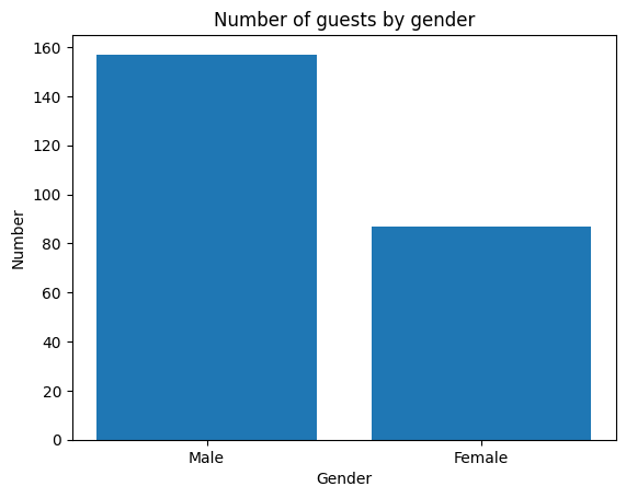
We can also determine relative frequencies using the .value_counts() function. To do this, we need to pass the parameter normalize=True.
tips['sex'].value_counts(normalize=True)
sex
Male      0.643443
Female    0.356557
Name: proportion, dtype: float64
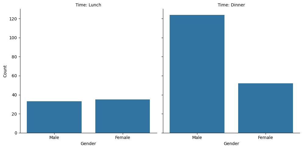
We can also create contingency tables using the .crosstab() function:
# Absolute frequency
print(pd.crosstab(tips['sex'], tips['time']))

# Relative frequency
print(pd.crosstab(tips['sex'], tips['time'], normalize='all'))
time    Dinner  Lunch
sex
Female      52     35
Male       124     33
time      Dinner     Lunch
sex
Female  0.213115  0.143443
Male    0.508197  0.135246
Split bar chart#
The following code creates a grouped bar chart that shows the number of guests by gender, separated by time of day
(Lunch vs. Dinner). This is achieved using seaborn’s catplot() function, which allows for the creation of multiple
subplots based on the values of a categorical feature.
The argument col="time" specifies that a separate chart should be created for each value in the time column. The
result is two side-by-side bar charts showing the distribution of genders for lunch and dinner, respectively.
This visualization is helpful to compare how the gender distribution of guests differs between the two meal times.
import pandas as pd
import matplotlib.pyplot as plt
import seaborn as sns
tips = pd.read_csv("tips.csv")
tips = sns.load_dataset("tips")

g = sns.catplot(
    data=tips,
    x="sex",
    kind="count",
    col="time",
)

g.set_titles("Time: {col_name}")
g.set_axis_labels("Gender", "Count")
plt.show()
Exercise 2#
🧠 During lunch the number of female and male guests who paid was roughly equal, but at dinner male guests paid for the meal significantly more often (more than twice as many). True or false?
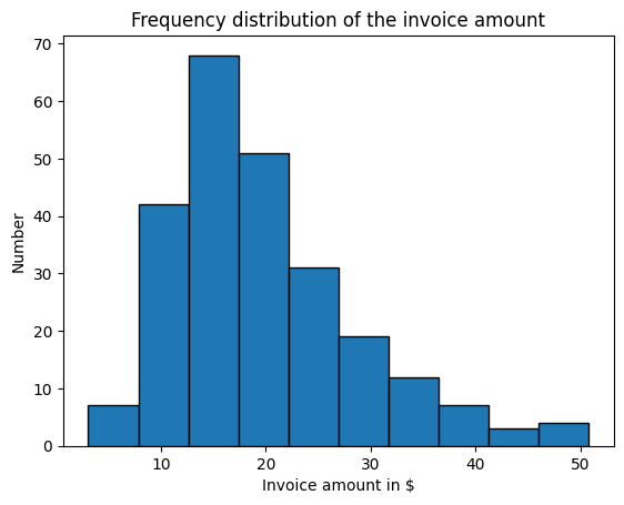
Create histogram#
The following code creates a histogram that visualizes the frequency distribution of invoice amounts in the dataset.
The function plt.hist() from the Matplotlib library is used to display how often invoice amounts within specific value
ranges occur.
edgecolor="black" adds clear borders to each bar.
The x-axis represents the invoice amounts in dollars, while the y-axis shows the number of invoices that fall into each interval.
import pandas as pd
import matplotlib.pyplot as plt
tips = pd.read_csv("tips.csv")

plt.hist(
    tips["total_bill"],
    edgecolor="black"
)
plt.title("Frequency distribution of the invoice amount")
plt.xlabel("Invoice amount in $")
plt.ylabel("Number")
plt.show()
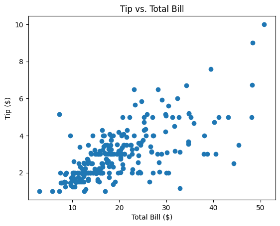
Create scatter plot#
The following code creates a scatter plot to visualize the relationship between the total bill and the tip amount.
The plt.scatter() function from the Matplotlib library is used to plot each observation as a point, where:
the x-axis represents the total bill in dollars
the y-axis represents the corresponding tip amount
Each point in the diagram corresponds to one row in the dataset. This type of visualization is useful for identifying patterns or trends — for example, whether higher bills are associated with higher tips.
import pandas as pd
import matplotlib.pyplot as plt
tips = pd.read_csv("tips.csv")

plt.scatter(
    tips["total_bill"],
    tips["tip"]
)

plt.title("Tip vs. Total Bill")
plt.xlabel("Total Bill ($)")
plt.ylabel("Tip ($)")
plt.show()
Exercise 3#
🧠 What was the tip amount for a bill of approximately $48? (Approximate reading is sufficient)
Create scatter plot with regression line#
The following code creates a scatter plot that shows the relationship between the total bill and the tip amount. In addition to the individual data points, a regression line is added that models the linear relationship between the two variables.
For this, we use the LinearRegression class from the sklearn library to create and train a linear regression model.
First, the dataset is loaded and the design matrix
X(total bill) as well as the target variabley(tip) are defined.Then, the model is initialized and trained on the data.
Next, the regression parameters (intercept and slope) are output.
Finally, the regression line is computed and displayed together with the original data in a scatter plot.
import pandas as pd
import matplotlib.pyplot as plt
from sklearn.linear_model import LinearRegression
import numpy as np
import seaborn as sns

# Load the dataset and define the design matrix X and the target variable y
tips = pd.read_csv("tips.csv")
X = tips[["total_bill"]]
y = tips["tip"]

# Initialize and train the linear regression model
model = LinearRegression()
model.fit(X, y)

# Output the regression parameters
print("Intercept (β0):", model.intercept_)
print("Slope (β1):", model.coef_[0])

# Create the value range for the regression line
X_plot = np.linspace(X.min(), X.max(), 100).reshape(-1, 1)
y_plot = model.predict(X_plot)

# Scatter plot of the original data
sns.scatterplot(data=tips, x="total_bill", y="tip")

# Draw the regression line
plt.plot(X_plot, y_plot, label="Regression line")

# Set the chart title and axis labels
plt.title("Tip vs. Total Bill with Regression Line")
plt.xlabel("Total Bill ($)")
plt.ylabel(str(round(model.coef_[0], 3)) + "x" + " + " + str(round(model.intercept_, 3)))
plt.legend()

# Display the plot
plt.show()
Intercept (β0): 0.9202696135546731
Slope (β1): 0.10502451738435337

Calculating correlations#
The following code calculates the correlation between the total bill and the tip amount. We consider two different ways of measuring correlation: the Pearson correlation and the Spearman correlation.
This is done using the pearsonr() and spearmanr() functions from the scipy.stats module. Both functions take the respective columns of our pandas dataset as input variables and compute the corresponding correlation as well as the p-value, which indicates whether the correlation is statistically significant.
import pandas as pd
import seaborn as sns
import matplotlib.pyplot as plt
from scipy.stats import pearsonr, spearmanr

# Load data
tips = pd.read_csv("tips.csv")

# Pearson correlation
pearson_corr, pearson_p = pearsonr(tips["total_bill"], tips["tip"])
print("Pearson correlation:", pearson_corr)
print("P-value (Pearson):", pearson_p)

# Spearman correlation
spearman_corr, spearman_p = spearmanr(tips["total_bill"], tips["tip"])
print("Spearman correlation:", spearman_corr)
print("P-value (Spearman):", spearman_p)
Pearson correlation: 0.6757341092113647
P-value (Pearson): 6.692470646863343e-34
Spearman correlation: 0.6789681219001009
P-value (Spearman): 2.501158440923619e-34
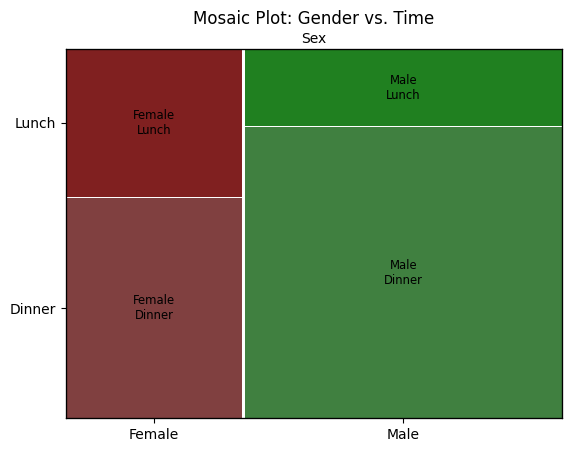
Create mosaic plot#
The following code creates a mosaic plot to visualize the relationship between the categorical variables gender (sex)
and time of day (time) in the dataset.
A mosaic plot shows the relative frequencies of combinations of categorical values using rectangles whose areas are proportional to the number of observations. In this example:
The x-axis is split according to the values of sex (Female / Male), and each section is further divided based on time (Lunch / Dinner). This allows you to easily see whether, for example, a higher proportion of men or women visited the restaurant at a particular time of day.
The plot is created using the mosaic() function from the statsmodels library, which is specifically designed for this
type of categorical visualization.
import pandas as pd
from statsmodels.graphics.mosaicplot import mosaic
import matplotlib.pyplot as plt
tips = pd.read_csv("tips.csv")

mosaic(tips, ['sex', 'time'])

plt.title("Mosaic Plot: Gender vs. Time")
plt.xlabel("Sex")
plt.ylabel("Proportion")
plt.show()
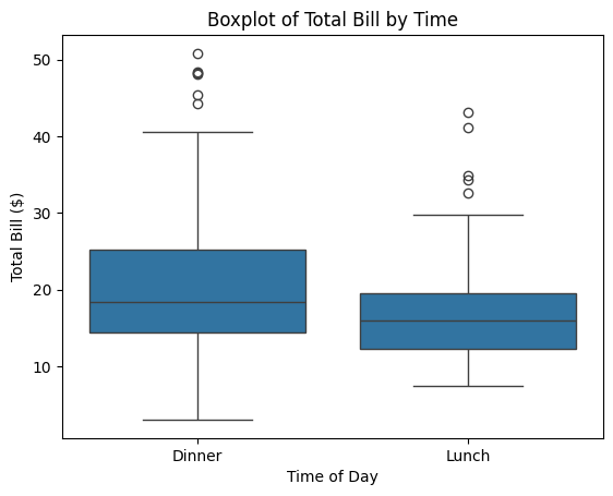
Create Boxplot#
This code uses the boxplot() function from the seaborn library (imported as sns) to create a box-and-whisker plot
comparing the distribution of total bill amounts for the two time categories: Lunch and Dinner.
Each box represents the spread of the data for one group and includes:
the median (horizontal line inside the box),
the interquartile range (the box itself),
and potential outliers (individual dots).
The x-axis shows the two time categories (time), while the y-axis displays the corresponding invoice
amounts (total_bill).
This visualization makes it easy to compare whether bills are generally higher at dinner than at lunch.
import pandas as pd
import seaborn as sns
import matplotlib.pyplot as plt
tips = pd.read_csv("tips.csv")

sns.boxplot(
    data=tips,
    x="time",
    y="total_bill",
)

plt.title("Boxplot of Total Bill by Time")
plt.xlabel("Time of Day")
plt.ylabel("Total Bill ($)")
plt.show()
Determine distribution function#
This code uses the ECDF() class from the statsmodels.distributions.empirical_distribution module to compute the
empirical cumulative distribution function of the total_bill values.
An ECDF shows, for each value on the x-axis, the proportion of observations that are less than or equal to that value. The result is a step-shaped curve that increases from 0 to 1. This type of plot is useful to understand how values are distributed across the dataset — for example, to estimate what share of bills are below a certain amount.
The function plt.step() is used to draw the ECDF as a step function, and grid lines are added to improve readability.
import pandas as pd
import matplotlib.pyplot as plt
from statsmodels.distributions.empirical_distribution import ECDF
tips = pd.read_csv("tips.csv")

ecdf = ECDF(tips["total_bill"])

plt.step(ecdf.x, ecdf.y, where="post")
plt.title("Empirical CDF of Total Bill")
plt.xlabel("Total Bill ($)")
plt.ylabel("Cumulative Probability")
plt.grid(True)
plt.show()
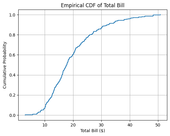
Exercise 4#
🧠 What percentage of the bills were at most $20?